yButton
Description�
The yButton is a clickable element with different optical styles, used to indicate its different states. The yButton can be used to trigger a user action. For example:
- Calling a custom JavaScript function
- Hiding and showing popups
- Interacting with yeetClipboards
- Sending an email
Basic Structure
The basic structure of the yButton shall be explained in the following. For the general structure of a yComponent please visit the YBase-components basic-structure.
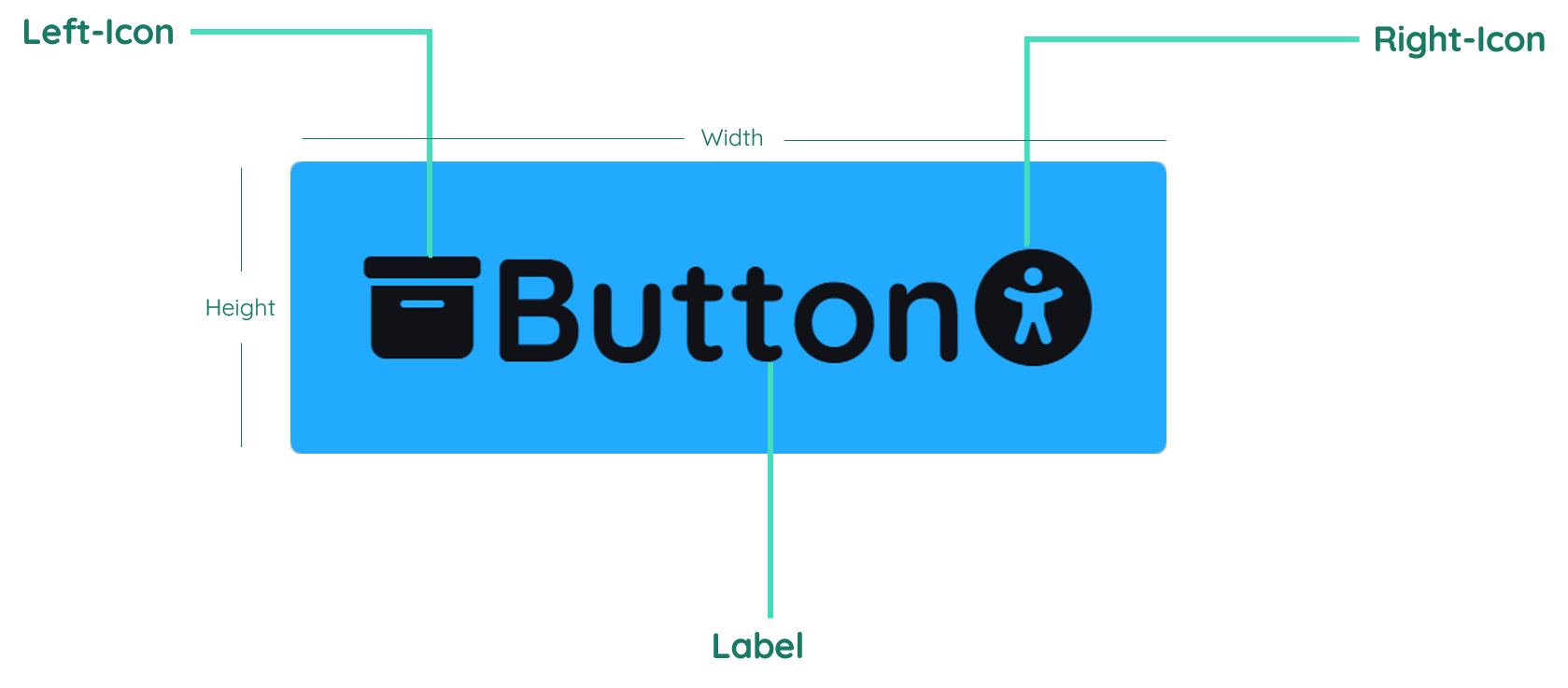
The yButton as seen above contains a label and an left-sided and right-sided icon.
Label
The label contains the text inside the button. It is normally in the center of the component, but can also be displayed on the right or left side. By changing the inner padding of the button, the label gets moved too.
Icon

The icon can be used to show an icon inside the yButton. You can have a maximum of two icons in a yButton. The icon can be before or after the text and if you want to have a yButton with one icon only, then you have to delete the text in the Label.
Properties
Through its various properties the yButton can be configured to suit your needs. The display below provides you with an overview of all the yButton properties.
Properties can be changed directly through three methods:
- Inside the Toolbar, which is positioned in your workarea next to your component right where you need it. It shows the most important properties, thus providing a fast and efficient way to configure your component in the most basic way.
- It may also occur in the Toolbar Extension, which is a seamless extension accesible as a dropdown item of the Toolbar. It extends the functionality of the Toolbar by providing advanced pickers for the most used properties.
- Inside the Detail Panel, which is located in the righthand drawer. Every property of a component can be configured here.
- Generic
- Style
- Button
- Events
METAread more
The identifier of the component that is unique within a page.
The type of the component. For this component it is -button.
The custom name of the component. It serves for better identification of the component.
The custom version of the Button-component. This can be used to ensure that all components work well together.
The CoreTheme, which will be apllied to the Button. For further information on themes visit the themes page.
The subtheme subordinated to the previously specified CoreTheme, which will be apllied to the Button. For further information on themes visit the themes page.
The group theme is a further variation of the subtheme which is specified especially for variations of a component inside the subtheme. For further information on themes visit the Theme-Manager page.
DISPLAYread more
This property specifies the display behavior of the component. This can be be set to:
- none
- block
- flex
- inline
This property specifies the type of positioning method used for the component. This can be be set to:
- static
- relative
- absolute
- sticky
- fixed
This property can toggle the visibility of the component. The two modes are completely hidden and fully shown.
SIZEread more
The minimum value for the width of the component. This can be set in:
- px
- pt
- em
- vw
- vh
- %
The minimum value for the height of the component. This can be set in:
- px
- pt
- em
- vw
- vh
- %
The value for the width of the component. This can be set in:
- px
- pt
- em
- vw
- vh
- %
- auto
The value for the height of the component. This can be set in:
- px
- pt
- em
- vw
- vh
- %
- auto
The maximum value for the width of the component. This can be set in:
- px
- pt
- em
- vw
- vh
- %
- none
The maximum value for the height of the component. This can be set in:
- px
- pt
- em
- vw
- vh
- %
- none
The flex property sets the length on flexible items. This sets the value in n-fold shares extrapolated to all other components with the flex display within the same container.
PLACEMENTread more
This property creates a space around the component, outside of the top border. This can be set in percent or pixels.
This property creates a space around the component, outside of the right border. This can be set in percent or pixels.
This property creates a space around the component, outside of the bottom border. This can be set in percent or pixels.
This property creates a space around the component, outside of the left border. This can be set in percent or pixels.
This property creates a space within the component, inside of the top border. This can be set in percent or pixels.
This property creates a space within the component, inside of the right border. This can be set in percent or pixels.
This property creates a space within the component, inside of the bottom border. This can be set in percent or pixels.
This property creates a space within the component, inside of the top border. This can be set in percent or pixels.
BACKGROUNDread more
The color of the background. This can be set as a color from a palette or a custom hex color.
BORDERread more
The color of the top border. This can be set as a color from a palette or a custom hex color.
The style of the top border. This can be be set to:
- solid
- dotted
- dashed
- none
The width of the top border. This can be set in percent or pixels.
The color of the right border. This can be set as a color from a palette or a custom hex color.
The style of the right border. This can be be set to:
- solid
- dotted
- dashed
- none
The width of the right border. This can be set in percent or pixels.
The color of the bottom border. This can be set as a color from a palette or a custom hex color.
The style of the bottom border. This can be be set to:
- solid
- dotted
- dashed
- none
The width of the bottom border. This can be set in percent or pixels.
The color of the left border. This can be set as a color from a palette or a custom hex color.
The style of the left border. This can be be set to:
- solid
- dotted
- dashed
- none
The width of the left border. This can be set in percent or pixels.
The radius of the corners of all the borders. This can be set in percent or pixels.
SHADOWread more
The shadow of the component. This is set by the 4 sub-properties x, y, blur and spread of the shadow-property, which can be further read about in the shadow-property section.
OPACITYread more
The opacity of all colored parts of the component. This value is set in percent.
LABELread more
The color of the label text. This can be set as a color from a palette or a custom hex color.
The font-family of the label text. This can be picked from a large list of provided fonts.
The font-weight of the label text. This can be set in a custom number, as example:
- 400 = normal(regular)
- 500 = medium
- 600 = semi bold
- 700 = bold
The font-style of the label text. This can be set to normal, italic or oblique.
The text-transformation of the label text. This can be set to:
- capitalize
- uppercase
- lowercase
- none
- full-width
The text-decoration of the label text. This can be set to:
- strikethrough
- underline
The font-size of the label text. This can be set in: -cm
- mm
- in
- px
- em
- ex
- ch
- rem
The font-align of the label text. This property moves the label text to the desired position, it can be set to left, center or right.
The actual written text in the label. There is no limit to the number of characters.
ICONread more
The position of the icon-element inside the Button-component. This can be set to:
- iconLeft
- iconRight
- iconBoth
- none
The primary-color of the icon-element inside the Button-component. This can be set as a color from a palette or a custom hex color.
The secondary-color of the icon-element inside the Button-component. This can be set as a color from a palette or a custom hex color.
The size of the icon. This can be set in: -cm
- mm
- in
- px
The icon to be set as the left icon of the icon-element inside the Button-component.
The icon to be set as the right icon of the icon-element inside the Button-component.
STATEread more
This property can disable or enable the active-state of the Button-component.
This property can disable or enable the disabled-state of the Button-component.
TOOLTIPread more
The text of the tooltip, which is displayed when hovering over the Button-component. If you do not insert anything, no tooltip appears.
The anchor link that will be displayed inside the tooltip.
The component itself. ???
MISCread more
This property can configure the Button-component to cause an emit every click or to be used to set a variable true and false.
LIFECYCLEread more
This specifies the function to be called, when the Button is initialized.
CONTROLread more
If this property is true the Button emits a command to create a new entity instance in the database on click. Clipboard
If this property is true the Button emits a command to read an entity instance in the database on click.
If this property is true the Button emits a command to update an entity instance in the database on click.
If this property is true the Button emits a command to delete an entity instance in the database on click.
INPUTread more
The event that is triggered when clicking inside the input field.
Usage
In this section you will find a collection of application scenarios and examples that illustrate how to leverage the yButton in ways that deviate from its standard behavior, as defined by yBase. This section aims to inspire and guide you through various possibilities, helping you to implement more complex or unique functionalities tailored to your specific needs. General properties that are universally applicable can be found in the yBase usage section.
Variations
- Elevated
- Flat
- Outlined
- Rounded
- Plain
Label
- Uppercase Label
Icon
- iconLeft
- iconBoth
- iconOnly
Calling a Custom JavaScript Function
The yButton component enables you to execute a custom JavaScript function each time it is clicked.
For instance, you could set up a function that creates a counter on the yButton, incrementing each time the yButton is pressed. Once the counter reaches the number 10, it automatically resets. The steps to achieve this are detailed below.
How to:
- Open the Detail Panel and proceed to Events, unfold Input to modify
EvtClicked. - Associate a custom JavaScript function to the yButton. This function will be invoked every time it is clicked.
- Include the provided JavaScript snippet below to implement a counter function.
Code example:
With this script, each click on the yButton will increment the displayed counter until it reaches 10, upon which it will display a congratulatory message and reset. The yButton background color will also change depending on the counters current state.
// function onButton_2_EvtClicked (apiObject, component, eventData) {

let buttonText = component.get("style", "label", "label");
// Convert string to number.
let counter = Number(buttonText);
// Not a number -> reset counter.
if (Number.isNaN(counter)) {
  counter = 0;
  component.set(
    "style",
    "background",
    "bgColor__normal",
    new apiObject.types.colorValue("#22aaffFF")
  );
  component.set(
    "style",
    "background",
    "bgColor__hover",
    new apiObject.types.colorValue("#49B9ffFF")
  );
}
// Increment counter.
else {
  counter++;
}
// Count until ten.
if (counter == 10) {
  buttonText = "Well done!";
  component.set(
    "style",
    "background",
    "bgColor__normal",
    new apiObject.types.colorValue("#00ff0080")
  );
  component.set(
    "style",
    "background",
    "bgColor__hover",
    new apiObject.types.colorValue("#00ff00FF")
  );
} else {
  buttonText = counter.toString();
}
// Log counter value in browser console.
console.log(counter);
// Set property value of button.
component.set("style", "label", "label", buttonText);

// }
Hiding and Showing Popups
You can use the yButton to open and close popups.
How to:
- Navigate to the popup you wish to control and open its Detail Panel.
- Within these settings, proceed to the Links section and select Open.
- In this area, change
Source-Link-Opento select the yButton you created earlier - the SourceLink should look like this:y-page:1:y-button:2:click.
And that's it, you can now test this functionality by entering the preview mode and clicking on the button to observe the popup's visibility change. Visit the yPopup section, if you want to know more about their behavior.
Interacting with Clipboards
You can use the yButton to control Clipboards. For example, you can set up a mechanism to delete a table entry with a simple button click.
How to:
- Open the Detail Panel and proceed to the events tab and locate the "Control" section. Here, you will need to enable the "Commit-Delete" option. This step empowers the yButton component with the capability to perform this functionality.
- Create a new Clipboard and enable the "Use Entity" toggle.
- Then you can click on "Entity-Properties" and edit the "Entity". This Clipboard should be linked to the entity containing the table entry you wish to delete. This way you have to fill in the data, like in the picture below.

- The _id under "Keys" should be the entry that you wish to delete.
- Finally, go to the "Events", edit it and select the yButton as SourceLink-1 via the SourceLink Picker. Dont forget that the event has to be "commit-delete".

This will establish a button that, when clicked, will delete the specified entry from your table.
If you want to know more about this topic, visit the Clipboard.
Sending an email
The yButton component can be used to send out emails.
For instance, you could create a newsletter formular with input elements and yButton to send out a confirmation mail.
How to:
- Create a new yInput with type
text. - Now select your yButton again.
- Open the Detail Panel and proceed to Events, unfold Input to modify
EvtClicked. - Associate a custom JavaScript function to the yButton. This function will be invoked every time it is clicked.
- Include the provided JavaScript snippet below to implement an email function.
Code example:
With this script, each click on the yButton will send out an email to the email-address which was assigned in the yInput.
// async function onButton_2_EvtClicked (apiObject, component, eventData) {

let emailInput = apiObject.ui.getObject(3, "y-input", "y-page", 1);
let email = emailInput.get("style", "content", "valueString");

if (email.length > 0 && email.contains("@")) {
  await apiObject.email.sendUserMail({
    path: "[Folder in the mediamanager for your template]",
    template: "[Your template]",
    placeholderValues:
      "{'yeet:Salutation': 'Greetings', 'yeet:FirstName': 'Lorem', 'yeet:LastName': 'Ipsum', 'yeet:RegistrationUrl': 'www.google.com', 'yeet:AdminName': 'Max Mustermann'}",
    attachmentInfos:
      "[{'FileName': 'mh2.png', 'Path': 'tutorialFolder', 'Content': ''}]",
    recipientAddress: email,
    recipientName: "Lorem Ipsum",
    subject: "Complete your registration!",
    userName: "testUser",
  });
} else {
  alert("Please enter a valid email-address!");
}

// }